#Imports for both Graph and Map
library(tidycensus)
library(tidyverse)
library(scales)
library(plotly)
library(ggiraph)

#Grabing median_income for bar blot
median_income <- get_acs(
  geography = "county",
  variables = "B19013_001",
  state = "IA",
  year = 2021
)

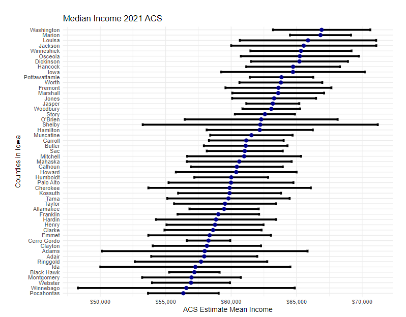
#View the mid range of countys mean income
median_income_data <- median_income %>%
  #reducing the number of countys the graph can display
  slice(floor(99 * 0.25):floor(99 * 0.75)+1) %>%
  #ordering from estimate highest to estimate lowest
  arrange(desc(estimate))

#The Bar plot
md_bar_plot <- ggplot(median_income_data, aes(x = estimate,
                                    y = reorder(NAME, estimate),
                                    tooltip = estimate,
                                    data_id = GEOID)) +
  #Generating the error bars
  geom_errorbar(aes(xmin = estimate - moe,
                    xmax = estimate + moe),
                    width = 0.5,
                    size = 1) +
  #Coloring the estimate dot
  geom_point_interactive(color = "darkblue", size = 1.5) +
  #Bottom Label range
  scale_x_continuous(labels = label_dollar()) +
  #County names and removing the Unnecessary words
  scale_y_discrete(labels = function(x) str_remove(x, " County, Iowa|, Iowa")) +
  #Graph labeling for views convince
  labs(title = "Median Income 2021 ACS",
       #subtitle = "Counties in Iowa",
       caption = "Data acquired with R and tidycensus. \nError bars represent margin of error around estimates of Median income.",
       x = "ACS Estimate Mean Income",
       y = "Counties in Iowa") +
  #Text Sizing
  theme_minimal(base_size = 8)
#Making the graph interactive
md_bar_plot_interactive <- girafe(ggobj = md_bar_plot) %>% girafe_options(opts_hover(css = "fill:purple;"))

#The Map
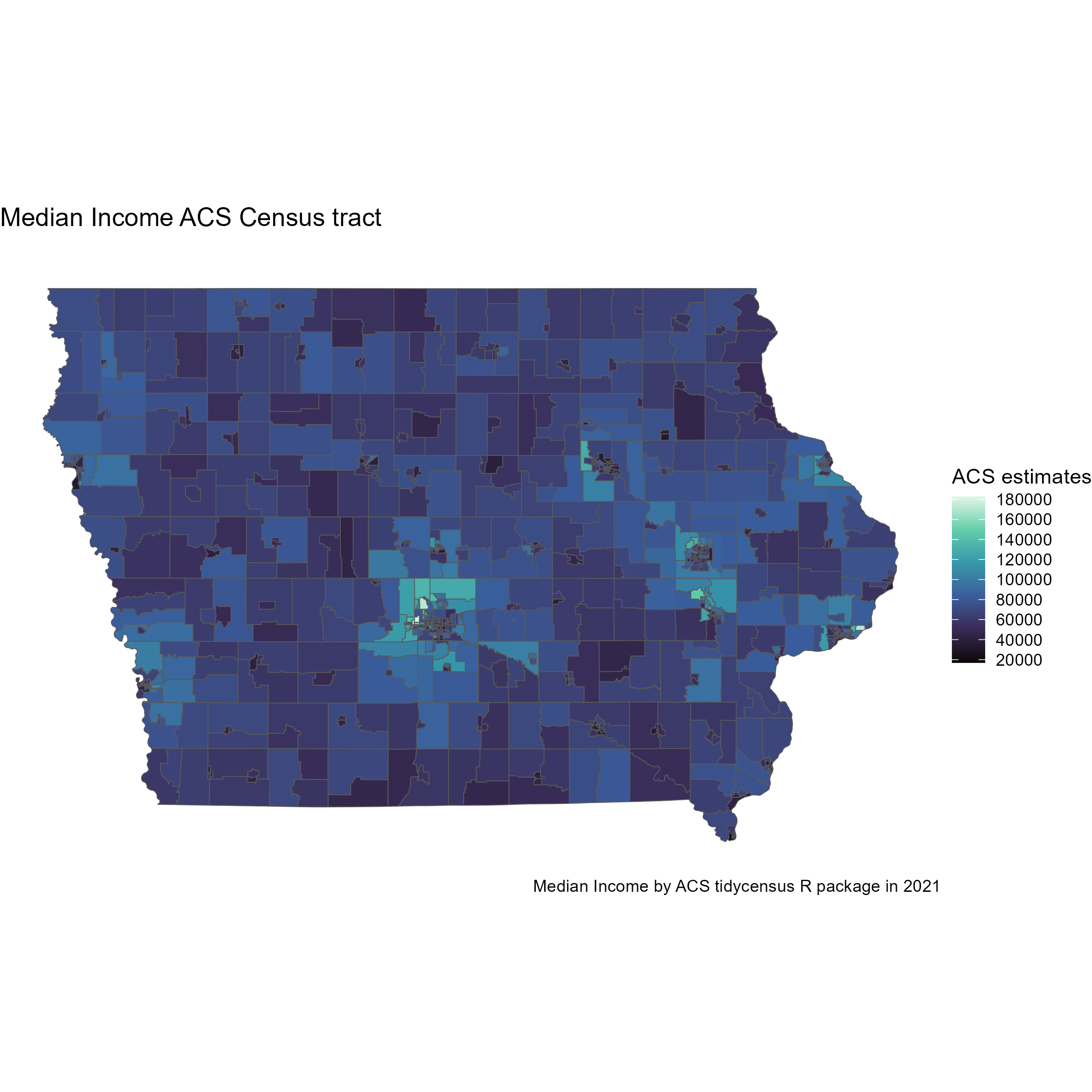
median_income_map <- get_acs(
  geography = "tract",
  variables = "B19013_001",
  state = "IA",
  year = 2021,
  geometry = TRUE
)
# The Map
md_chorpleth_map <- ggplot(median_income_map, aes(fill = estimate)) +
  #The map display
  geom_sf() +
  #Empty theme of the map
  theme_void() +
  #Colors the map
  scale_fill_viridis_c(option = "G", n.breaks = 10) +
  #Information
  labs(title = "Median Income by Census track",
       subtitle = "",
       fill = "ACS estimates",
       caption = "Median Income by ACS tidycensus R package in 2021")


#This renders the bar plot
md_bar_plot_interactive

#This renders the chorpleth map
md_chorpleth_mapBoth a bar plot, and chorpleth map were made from the American Community Survey (ASC) data using Tidycensus library in R.

